Redesigning the Aussie Meat Academy
This is part of a brief response to AMA
The Aussie Meat Academy page redesign aims to transform it into a seamless and engaging hub for all users. Our goal is to provide a centralised platform that not only facilitates content discovery but also fosters a vibrant community around the art and science of meat.
We're designing for both newcomers and seasoned enthusiasts, offering a personalised experience through persona-based content delivery. Key features will include:
-
Self-Paced Learning Series: Curated educational pathways for foundational knowledge and advanced techniques.
-
Masterclass Workshops: Interactive sessions led by experts, focusing on specialised skills and in-depth understanding.
-
Community Forums: A dynamic space for users to connect, share insights, ask questions, and collaborate.
Project overview
The project
To create an intuitive and rewarding journey, empowering users to deepen their knowledge, hone their skills, and connect with a passionate community, all within a single, cohesive digital environment.
The problem
MLA currently runs a successful, global Aussie Meat Academy program which is restricted in its reach due to its reliance on physical events.
The goal
Engaging a broad and global audience of food professionals with educational and inspirational Aussie Meat Academy content, will help us achieve our goal of positioning Australia as preferred choice in our category
My role
UI Designer
Responsibilities
Researching UI, wireframing, prototyping, User testing
Understanding the users
User summary
Many potential learners face significant barriers to attending physical meat education events, including constraints related to time, geographical distance, cultural considerations, and cost. Our research indicates a strong user preference for localised Aussie Meat Academy programs delivered in a flexible digital format. Users want to be equipped with essential knowledge and technical expertise, receive guidance, and engage in meaningful interactions—all within a structure that respects their diverse time zones and personal commitments.
Pain points
-
Busy Schedules & Time Constraints:
Users often have packed daily routines, making it exceptionally difficult to commit to the fixed time and location demands of physical events. This isn't just about inconvenience; it's about a fundamental clash with their availability.
-
Information Overload & Website Fatigue:
The current landscape forces users to scatter their search across numerous websites to gather comprehensive information, leading to frustration, wasted time, and a fragmented learning experience. There's no single, reliable source for their needs.
-
Language & Cultural Barriers:
Generic or unlocalised programs fail to connect with diverse audiences. Users need content that speaks to their specific cultural context and local nuances, ensuring the information is not only understood but truly resonates and feels relevant.
-
Fragmented Competitive Landscape:
While competitors exist, their offerings may also suffer from similar accessibility issues or lack the holistic, personalised, and community-driven approach our digital academy aims to provide. This isn't just a pain point, but an opportunity to differentiate by offering a superior, integrated solution.
Problem statement
Users required to commit to the physical events which involved time, distances, cost and language/cultural barrier. Ultimately all they need is equip themselves with knowledge and technical expertise about Australian red meat which can be in digital format so they can access it anytime, anywhere.
Persona 1
Adam is a food retailer who needs knowledges about red meat because he wants to be seen as red meat leader within the community.

Persona 2
Eve is a chef who needs menu ideation because of her expanding clientales.

Starting the design
Digital wireframe
UI/UX considerations
-
User Journeys: Map out the typical paths different personas will take through the hub.
-
Information Architecture: How will content be organised for easy navigation and discovery?
-
Visual Hierarchy: How will we guide users' eyes to important information and calls to action?
-
Personalisation Mechanics: How will the persona-based content actually be delivered and displayed? (e.g., preference settings, recommended content algorithms).
-
Engagement Metrics: What key performance indicators (KPIs) will we track to measure the success of the hub?

Final design
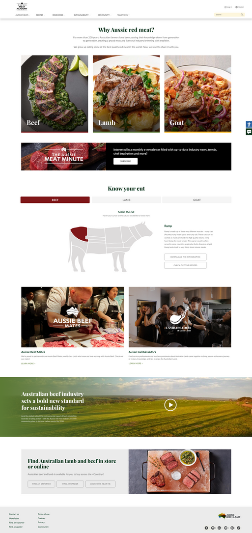
High fidelity design
Due to time constrain we have to proceed to hifi design for presentation.

.png)
Accessibility Considerations
-
Color and Contrast:
Ensure all text (body text, headings, links, button text) has sufficient contrast against its background.
Interactive elements like buttons, links, and form fields need good contrast to be distinguishable.
-
Typography and Readability:
Ensure body text font size is large enough to be easily readable
Adequate line height for good readability, especially for users with dyslexia or cognitive disabilities. Ensure default word and letter spacing is not too tight or too wide, which can hinder readability.
-
Responsiveness and Mobile Accessibility
Everyone uses different devices, cater for mobile users, better user experience, more affordable to maintain a responsive website that adapts.
-
Navigation and Site Consistency
Consistent Navigation: The main navigation bar should be consistent across all pages.Clear Link Text, Sticky Navigation, breadcrumbs:
Site map

Demo
Content course to showcase learning pathway
More pages